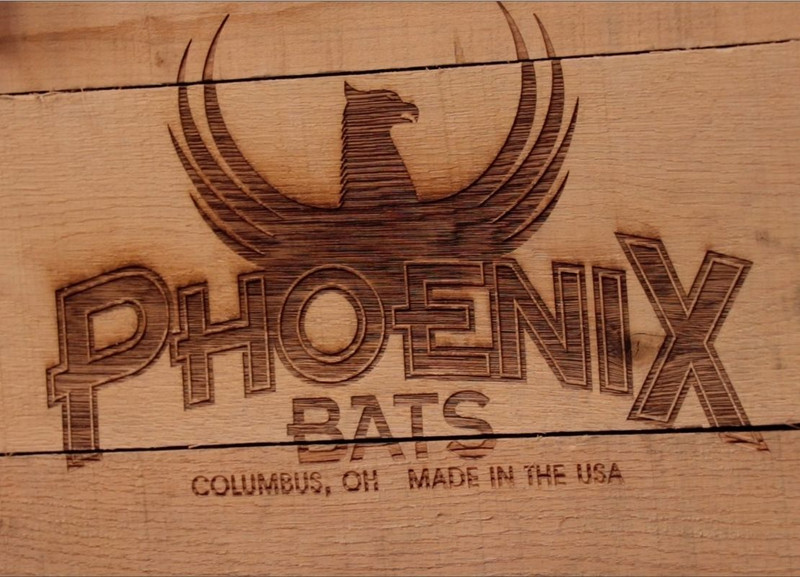
Blazed on our baseball bats, website, and everything we send out, our new flaming P logo gives Phoenix a fresh look that connects with players of all stripes – from the weekend warriors to the pro sluggers. But the story behind how the logo came to life is a revealing look into how we operate on a daily basis at Phoenix.
The beginning of an evolution.
Rewind three years. At the time, Brandon Guyer was taking his swings with a Phoenix bat. He wasn’t the only one. According to Brandon’s agent, Josh Yates, Phoenix was developing a strong relationship with players of various skill levels:
The guys really loved Phoenix. Phoenix did such an amazing job delivering custom bats quickly to players – delivering on individual requests for everything from color selection to weights. You could tell the guys really appreciated the personal touch Phoenix provided. But the branding needed to be stronger to connect with more players – the logo really needed to pop to give Phoenix the edge in the locker rooms and dugouts.
Relying on Brandon for feedback, Josh began asking what Phoenix might be able to do to get our bats into the hands of more players. Those conversations would become the foundation for the evolution of our logo. Brandon revealed that players want to swing a bat that has three elements:
- It’s got to have a good feel about it.
- It’s got to have quality grain.
- It’s got to have a look.
We had 2 of the 3 elements nailed according to Brandon. He loved the way our bat felt – light weight with a dependable grip, and a good feel through the swing. The bat was sturdy, with straight grain ensuring a solid point of contact with the ball. But there was one area where Brandon and Josh felt we could improve: If we wanted to grow our business and our impact, we needed to take a hard look at our look.
A logo, resurrected.
After talking with Brandon and Josh, we began the process of re-imagining a brand mark that would capture the eyes of weekend warriors and big leaguers alike. We were convinced that our look needed to have a fresh face – a bold, attention-grabbing mark that would compliment the preferences of our players.
The old Phoenix logo had served her purpose well, but we felt strongly that it was time to move on from the Phoenix bird logo and move forward with a new image. We quickly realized we would need a mark that would communicate:
- The burning passion that a player has for the game.
- Our burning desire for providing the highest quality baseball bat possible.
Commissioning the services of a talented Columbus graphic artist named Darrin Hoover, we put the task in his capable hands and asked for a homerun.
And thus, the P logo with flames was born.
Embracing the fire of competition, Darrin delivered. The flames are a nod to our history of bringing vintage bats to life. Commissioned by the Ohio Historical Society, Charley Trudeau was given the task of creating wooden bats that hadn’t been available on the market in over 150 years. The “Phoenix” name derives from this original call, as Lefty saw the Greek mythical account of the Phoenix war-bird rising from the ashes as symbolic to his work of resurrecting vintage baseball bats.
Adding a modern spin, the fire further represents the passion of players of every skill level who rise to the occasion each time he or she steps up to the plate. After seeing the finalized logo concept, we felt we had a homerun on our hands.
Both Brandon and Josh agreed. After seeing the new mark presented, they were immediately drawn to the new look:
The new look is exactly what Brandon felt players would want to see. It’s the kind of logo that will draw attention in a clubhouse – the kind of image that a player wants to identify with.
Some companies talk about listening to their customers. We actually do – just ask Brandon and Josh. Our new look is a perfect display of our commitment to quality, our strong relationship with our players, and our undeniable thirst for strong performance. This is a mark made for players who leave their own marks.

